BLOG
Wick Wellness Logo Touch-up
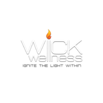
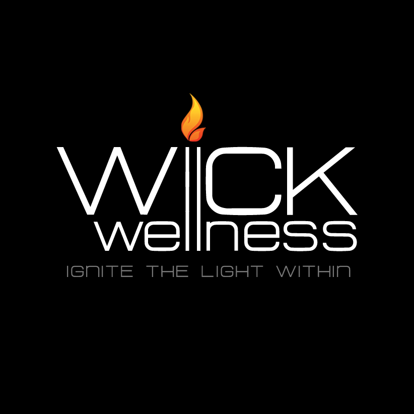
I kept catching glimpses of Chad’s logo on social media, and I loved it; but something seemed off in the alignment, to my eye at least, so I approached him and pointed out what I was seeing and offered to give it a touch-up.
I used the double Ls as the alignment point for the rest and turned them into a candle, which also served as the “i” in WICK. I also increased the weight of the font, aligned the two Ws, and condensed the logo, eliminating a lot of the blank space, making it more readable with a quick glance.
OLD LOGO

NEW LOGO

"Forge Branding was able improve my existing logo; he made it more appealing and user friendly. Excellent and timely communication. Would highly recommend."


