Logo Design for Andrea Benham

BLOG

Logo Design for Andrea Benham

Andrea reached out to me as a referral from Rick Corbo after I completed his logo. She didn’t really have much to offer for instruction, not really knowing what she wanted, so I kept the logo fairly simple.

Because she was a singer, I gave a hat-tip to her musical career by incorporating some musical notes.

As is standard with all my clients, I presented her with a couple different variations—I was partial to the one on the left, which featured less obvious representations of music notes in a more condensed logo, whereas she was partial to the one on the right.

Logo Design for DJ Kenny Kruze

BLOG

Logo Design for DJ Kenny Kruze

Kenny and I have been connected on social media for a while no, but we recently started talking more about his DJ career and where he wants to go with it. I’ve been giving him pointers with creating a consistent presence across all of his social media platforms, and also creating a recognizable brand so that promoters and producers can find him easier.

After running through a few designs with Kenny that weren’t really hitting the mark, I went back to the drawing board and Kenny mentioned that he really liked bright neon green and yellow.

Knowing the trends in the Promotional Products industry, I suggested a lime green and black logo that stood out. When I presented him with a few different options, we narrowed it down to the logo and the icon that you see below, but we’ve also developed a few variations to coordinate with some of the artwork, which you’ll also see below that.

HORIZONTAL LOGO

ICON

STACKED LOGO

HORIZONTAL LOGO - RED

Logo Design for ATL Spades

Logo Design for DJ Ted Bishop

Logo Redesign for DJ BioZounds

BLOG

Logo Redesign for DJ BioZounds

When Carlos came to me and asked me to re-work his logo, I was quite nervous of not meeting or exceeding his expectations. As someone who knows firsthand how attached you can get to a logo—the iconic representation of any brand or identity—changing it is sometimes more difficult than creating that identity for the first time.

Thankfully, I have known Carlos for a little time, both professionally and personally, so I’ve been able to witness his style and identity firsthand. Carlos is edgy, yet elegant and smooth; classic, yet modern—so I felt a logo with clean lines and curves that possessed his edginess best enveloped his identity.

If you look below, you’ll see his previous logo, which I used as inspiration:

OLD LOGO

NEW LOGO

Logo Redesign for DJ Alle Reich

BLOG

Logo Redesign for DJ Alle Reich

When I signed Alex Galdino with Spark Talent Management, he was looking to have his logo redesigned, so I offered to do it. Below, you’ll see the before and after.

OLD LOGO

NEW LOGO & icON

Logo Design for DejaVu Afterhours

BLOG

Logo Design for DejaVu Afterhours

When Kurtis rebranded his Code Red event brand into Deja Vu Afterhours, I offered to design his logo for his new brand and do his future event flyers.

The logo is pictured below.

Logo Design for Abraham Neri

BLOG

Logo Design for Abraham Neri

As part of my Talent Management agency, Spark, I offer free graphic design to all of my talent, including logo creation or revision.

So when Abraham and I started chatting about the possibility of me managing him, the told me that he had a designer doing a logo for him already. Skip forward a couple months, and the designer still hadn’t given him any sort of progress on his logo, so I told him that I would take over the design.

After quite a few rounds of samples, he chose the purple and white   TEXT+ICON logo that is pictured above in the header.

The brand standard of the logo is the purple and white you see, but I  created a couple different color variations of it, which I’ve used on some of his SoundCloud set covers so that it blended with the design of the cover.

The logo itself lends itself to  infinite  variations, which is   a characteristic I like to build into all my logos (if the branding allows for or warrants it).

Logo Design for Alma y Tambores

BLOG

Logo Design for Alma y Tambores

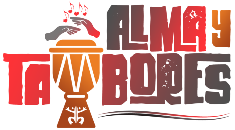
When I was approached by Ted, one of the two founders of Alma y Tambores, he asked for a tribal feel for the logo and to somehow incorporate the djembe drum, the signature instrument of their sound.

Because Carlos (the other founder) was Puerto Rican and his heritage was also an influence for their sound, I wanted to incorporate the Taino symbol for the coquí, Puerto Rico’s very vocally recognizable frog, somewhere within the design as well.

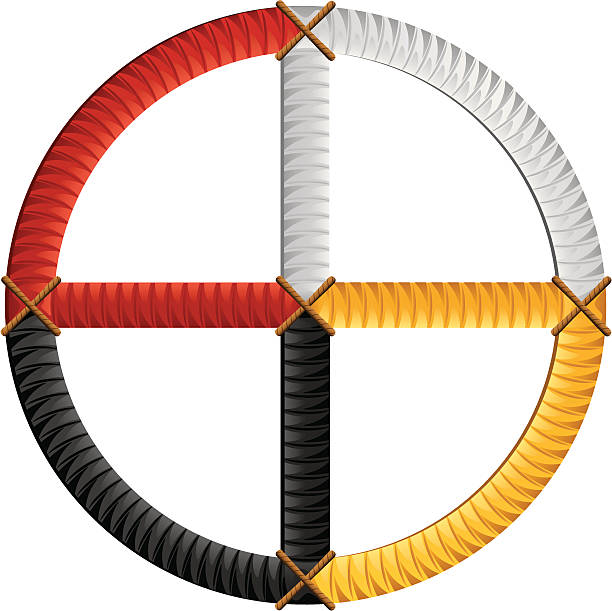
The color palette was inspired by the 4 colors of the Native American medicine wheel, pictured below, and the final logo is picture above.

Logo Re-Design for Israel Reynoso

BLOG

Logo Re-Design for Israel Reynoso

When I signed Israel to Spark, he already had a logo—one that was well-crafted, but rather simple and didn’t create any sort of recognition beyond his name. One reason why brands like Nike or McDonald’s are so recognizable is because of the icons associated with the brand that standalone from the name itself. I wanted to create a logo that contained iconography that could stand apart from Israel’s name. Reynoso comes from the Spanish word, Rey, meaning King, and what better way to depict that meaning than a crown? And when I think of deejays, the crown all of them wear is the unforgettable headphones required for the job—combine those two symbols, and you have a the icon you see below: a pair of headphones in the shape of a crown with audio waves mimicking the shape of that crown as well to eliminate as much negative space as possible, keeping the logo compact easily-identifiable.

OLD LOGO

REDESIGNED LOGO